(Article with introduction, checkbox, radio button and text field sections + examples added) |
(Checkbox text corrected, monor rewording) |
||
| Line 1: | Line 1: | ||
__TOC__ | __TOC__ | ||
| − | Inserting forms | + | Inserting forms into your documents is an advanced feature that requires both knowledge of HTML and access to a server that will process the data sent from the form. Due to these prerequisites the form toolbar might be disabled by the system administrator and not available in the installation of CKEditor that you are using. |
== Form Element == | == Form Element == | ||
| − | The <code>form</code> element is a container for all form contents, which means that all form controls (for example checkboxes, text fields, or buttons) must be placed inside it. To insert the form | + | The <code>form</code> element is a container for all form contents, which means that all form controls (for example checkboxes, text fields, or buttons) must be placed inside it. To insert the form into your document, press the [[Image:CKEditor_form.png|Form]] toolbar button. The '''Form Properties''' dialog window that will open lets you set basic form settings that control the form's interaction with the server. |
[[Image:CKEditor_form_properties.png|frame|center|Form Properties dialog window in CKEditor]] | [[Image:CKEditor_form_properties.png|frame|center|Form Properties dialog window in CKEditor]] | ||
| Line 20: | Line 20: | ||
[[Image:CKEditor_form_example.png|frame|center|A form frame visible in the editing area of CKEditor]] | [[Image:CKEditor_form_example.png|frame|center|A form frame visible in the editing area of CKEditor]] | ||
| − | Since the form element is | + | Since the form element is just a container you need to add some form controls to make it usable. To do so, place the cursor inside the form frame and use further CKEditor form toolbar buttons. |
<ins>'''Important note:'''</ins> A form cannot be nested in another form or overlap with it, so you cannot start a new form inside the previous one. | <ins>'''Important note:'''</ins> A form cannot be nested in another form or overlap with it, so you cannot start a new form inside the previous one. | ||
== Checkbox == | == Checkbox == | ||
| − | A checkbox is a form element that lets you select an item | + | A checkbox is a form element that lets you select an item and send your selection to the server when you are submitting the form. Multiple checkboxes may be combined in a logical group, although their selection is independent of one another, which means that more than one item of the group can be selected at a time. |
| − | To insert a checkbox | + | |
| + | To insert a checkbox into a document in CKEditor, place the cursor inside the form element and press the [[Image:CKEditor_checkbox.png|Checkbox]] toolbar button. The '''Checkbox Properties''' dialog window that will open lets you set the name and value of a checkbox as well as decide whether it should be selected by default. | ||
[[Image:CKEditor_checkbox_properties.png|frame|center|Checkbox Properties dialog window in CKEditor]] | [[Image:CKEditor_checkbox_properties.png|frame|center|Checkbox Properties dialog window in CKEditor]] | ||
| Line 34: | Line 35: | ||
* '''Name''' – the name of the checkbox element (<code>name</code> attribute). | * '''Name''' – the name of the checkbox element (<code>name</code> attribute). | ||
* '''Value''' – the value of the checkbox element (<code>value</code> attribute). | * '''Value''' – the value of the checkbox element (<code>value</code> attribute). | ||
| − | * '''Selected''' – the parameter that specifies the default | + | * '''Selected''' – the parameter that specifies the default state of the checkbox — whether it is selected or not (<code>checked</code> attribute). |
Once you configure the checkbox and click the '''OK''' button, the checkbox will be visible in CKEditor [[CKEditor_3.x/Users Guide/Interface/Editing Area|editing area]] and you will be able to add some text that describes the checkbox option. | Once you configure the checkbox and click the '''OK''' button, the checkbox will be visible in CKEditor [[CKEditor_3.x/Users Guide/Interface/Editing Area|editing area]] and you will be able to add some text that describes the checkbox option. | ||
| Line 42: | Line 43: | ||
== Radio Button == | == Radio Button == | ||
A radio button is a form element that lets you select one item from the list and send your selection to the server when you are submitting the form. Radio buttons are usually used in groups and they differ from another form element, the checkbox, in that only one item can be selected at a time. | A radio button is a form element that lets you select one item from the list and send your selection to the server when you are submitting the form. Radio buttons are usually used in groups and they differ from another form element, the checkbox, in that only one item can be selected at a time. | ||
| − | To insert a radio button | + | |
| + | To insert a radio button into a document in CKEditor, place the cursor inside the form element and press the [[Image:CKEditor_radiobutton.png|Radio Button]] toolbar button. The '''Radio Button Properties''' dialog window that will open lets you set the name and value of a radio button as well as decide whether it should be selected by default. | ||
[[Image:CKEditor_radiobutton_properties.png|frame|center|Radio Button Properties dialog window in CKEditor]] | [[Image:CKEditor_radiobutton_properties.png|frame|center|Radio Button Properties dialog window in CKEditor]] | ||
| Line 50: | Line 52: | ||
* '''Name''' – the name of the radio button element (<code>name</code> attribute). | * '''Name''' – the name of the radio button element (<code>name</code> attribute). | ||
* '''Value''' – the value of the radio button element (<code>value</code> attribute). | * '''Value''' – the value of the radio button element (<code>value</code> attribute). | ||
| − | * '''Selected''' – the parameter that specifies the default | + | * '''Selected''' – the parameter that specifies the default state of the radio button — whether it is selected or not (<code>checked</code> attribute). |
Once you configure the radio button and click the '''OK''' button, the radio button will be visible in CKEditor [[CKEditor_3.x/Users Guide/Interface/Editing Area|editing area]] and you will be able to add some text that describes the radio button option. | Once you configure the radio button and click the '''OK''' button, the radio button will be visible in CKEditor [[CKEditor_3.x/Users Guide/Interface/Editing Area|editing area]] and you will be able to add some text that describes the radio button option. | ||
| Line 61: | Line 63: | ||
A text field element comes in two variants. The first one lets you enter the text and see it as you type. The second one is used for entering passwords and obscures the typed characters with an asterisk (*), a bullet (•), or another symbol used by the browser. | A text field element comes in two variants. The first one lets you enter the text and see it as you type. The second one is used for entering passwords and obscures the typed characters with an asterisk (*), a bullet (•), or another symbol used by the browser. | ||
| − | To insert a text field | + | To insert a text field into a document in CKEditor, place the cursor inside the form element and press the [[Image:CKEditor_textfield.png|Text Field]] toolbar button. The '''Text Field Properties''' dialog window that will open lets you set the name, value, type, and size of a text field. |
[[Image:CKEditor_textfield_properties.png|frame|center|Text Field Properties dialog window in CKEditor]] | [[Image:CKEditor_textfield_properties.png|frame|center|Text Field Properties dialog window in CKEditor]] | ||
| Line 78: | Line 80: | ||
| − | + | The figure above shows two text fields added to a form. The first one is a '''Text''' type with character width set to 50 and the second one is a '''Password''' type with a default character width set by the browser. | |
Revision as of 09:08, 8 November 2010
Inserting forms into your documents is an advanced feature that requires both knowledge of HTML and access to a server that will process the data sent from the form. Due to these prerequisites the form toolbar might be disabled by the system administrator and not available in the installation of CKEditor that you are using.
Form Element
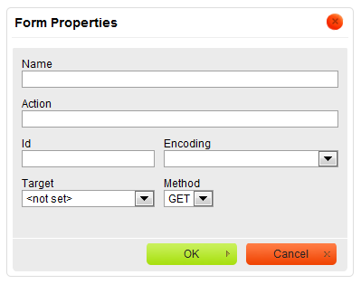
The form element is a container for all form contents, which means that all form controls (for example checkboxes, text fields, or buttons) must be placed inside it. To insert the form into your document, press the ![]() toolbar button. The Form Properties dialog window that will open lets you set basic form settings that control the form's interaction with the server.
toolbar button. The Form Properties dialog window that will open lets you set basic form settings that control the form's interaction with the server.
Below is an overview of all Form Properties dialog window elements:
- Name – the name of the form (
nameattribute). - Action – the location of the application that processes the form data (
actionattribute). - Id – the unique identifier for a form element in the document (
idattribute). - Encoding – the parameter that specifies how the form data should be encoded before sending to the server (
enctypeattribute). - Target – the window where the results will be displayed after you send the form to the server (
targetattribute). You can choose between New Window (_blank), Topmost Window (_top), Same Window (_self), or Parent Window (_parent). - Method – the way the data should be sent to the server (
methodattribute). You can choose betweenGETandPOST.
Once you configure the form and click the OK button, the form area will be visible in CKEditor editing area as a frame with a red dotted border.
Since the form element is just a container you need to add some form controls to make it usable. To do so, place the cursor inside the form frame and use further CKEditor form toolbar buttons.
Important note: A form cannot be nested in another form or overlap with it, so you cannot start a new form inside the previous one.
Checkbox
A checkbox is a form element that lets you select an item and send your selection to the server when you are submitting the form. Multiple checkboxes may be combined in a logical group, although their selection is independent of one another, which means that more than one item of the group can be selected at a time.
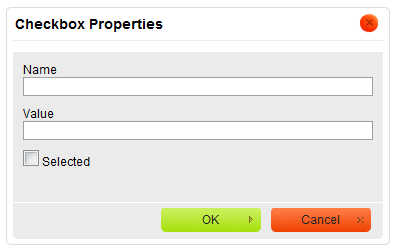
To insert a checkbox into a document in CKEditor, place the cursor inside the form element and press the ![]() toolbar button. The Checkbox Properties dialog window that will open lets you set the name and value of a checkbox as well as decide whether it should be selected by default.
toolbar button. The Checkbox Properties dialog window that will open lets you set the name and value of a checkbox as well as decide whether it should be selected by default.
Below is an overview of all Checkbox Properties dialog window elements:
- Name – the name of the checkbox element (
nameattribute). - Value – the value of the checkbox element (
valueattribute). - Selected – the parameter that specifies the default state of the checkbox — whether it is selected or not (
checkedattribute).
Once you configure the checkbox and click the OK button, the checkbox will be visible in CKEditor editing area and you will be able to add some text that describes the checkbox option.
Radio Button
A radio button is a form element that lets you select one item from the list and send your selection to the server when you are submitting the form. Radio buttons are usually used in groups and they differ from another form element, the checkbox, in that only one item can be selected at a time.
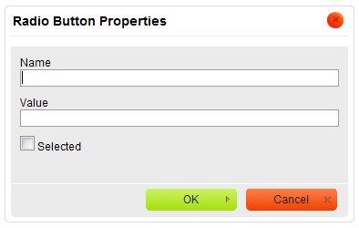
To insert a radio button into a document in CKEditor, place the cursor inside the form element and press the ![]() toolbar button. The Radio Button Properties dialog window that will open lets you set the name and value of a radio button as well as decide whether it should be selected by default.
toolbar button. The Radio Button Properties dialog window that will open lets you set the name and value of a radio button as well as decide whether it should be selected by default.
Below is an overview of all Radio Button Properties dialog window elements:
- Name – the name of the radio button element (
nameattribute). - Value – the value of the radio button element (
valueattribute). - Selected – the parameter that specifies the default state of the radio button — whether it is selected or not (
checkedattribute).
Once you configure the radio button and click the OK button, the radio button will be visible in CKEditor editing area and you will be able to add some text that describes the radio button option.
Text Field
A text field is a form element that lets you enter text into a single-line field and send your input to the server when you are submitting the form. Text fields differ from another form element, the textarea, in that they are single-line fields and thus are meant for shorter entries.
A text field element comes in two variants. The first one lets you enter the text and see it as you type. The second one is used for entering passwords and obscures the typed characters with an asterisk (*), a bullet (•), or another symbol used by the browser.
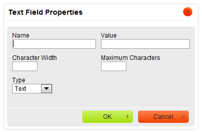
To insert a text field into a document in CKEditor, place the cursor inside the form element and press the ![]() toolbar button. The Text Field Properties dialog window that will open lets you set the name, value, type, and size of a text field.
toolbar button. The Text Field Properties dialog window that will open lets you set the name, value, type, and size of a text field.
Below is an overview of all Text Field Properties dialog window elements:
- Name – the name of the text field element (
nameattribute). - Value – the value of the text field element (
valueattribute). This text will be visible in the text field when the form is loaded in the browser. - Character Width – the width of the text field specified as the number of characters that will fit in the field (
sizeattribute). If omitted, the text field will have a default size determined by the browser. - Maximum Characters – the limit of characters that may be entered into the text field (
maxlengthattribute). If omitted, the length of text that you enter into the field will be unlimited and once you exceed the size of the box, the text will scroll to the right. - Type – the parameter that specifies whether the form field will be used for plain text (
type="text"attribute) or passwords (type="password"attribute).
Once you configure the text field and click the OK button, the text field will be visible in CKEditor editing area with the default value shown either as plain text or a series of asterisks/bullets.
The figure above shows two text fields added to a form. The first one is a Text type with character width set to 50 and the second one is a Password type with a default character width set by the browser.


