Contents
The aim of this tutorial is to demonstrate how to create a custom plugin dialog window that contains various types of fields.
We are going to develop a Simple Link plugin that can replace the more feature-rich default Link feature of CKEditor with a simplified solution. The plugin dialog window will let the user insert a link through a customized dialog window that is opened after clicking a dedicated toolbar button.
The plugin will be named simpleLink.
Plugin Files
Firstly, we will need to create the simpleLink folder inside the plugins directory of the CKEditor installation.
Inside the newly created simpleLink folder we are going to place the plugin.js file that will contain the plugin logic. Apart from that, since we will also need a toolbar icon for our plugin, we are going to add an images folder and subsequently place the icon.png file inside.
To sum up, we will need the following file structure for our plugin to work:
-
ckeditor root-
plugins-
simpleLink-
images-
icon.png
-
-
plugin.js
-
-
-
Plugin Source Code
With the following structure ready, it is time to open the plugin.js file in a text editor and to start creating the source code of the plugin.
CKEDITOR.plugins.add( 'simpleLink',
{
	init: function( editor )
	{
		// Plugin logic goes here...
	}
});
All CKEditor plugins are created by using the CKEDITOR.plugins.add function. This function should contain the plugin name ('simpleLink') and the plugin logic placed inside the init function that is called upon the initialization of the editor instance.
Creating an Editor Command
We want our plugin to have a dialog window, so we need to define an editor command that opens a new dialog window. To do this, we will need to use the addCommand function opening the simpleLinkDialog window that we are going to define in a moment by using the CKEDITOR.dialogCommand function.
editor.addCommand( 'simpleLinkDialog', new CKEDITOR.dialogCommand( 'simpleLinkDialog' ) );
Creating a Toolbar Button
The plugin dialog window is to be opened by using a toolbar button. To this end, we need to define a button that will be associated with the dialog window. The CKEditor.ui.addButton function accepts a button name ('SimpleLink') along with the definition of the tooltip text (label) and the button icon (icon). Note that this.path is the directory where the plugin.js file resides.
These parameters are responsible for the button presentation. To make the button actually work, we need to connect it to the plugin command name defined above by using the command parameter.
editor.ui.addButton( 'SimpleLink',
{
	label: 'Insert a Link',
	command: 'simpleLinkDialog',
	icon: this.path + 'images/icon.png'
});
CKEditor Initialization
It is now time to initialize a CKEditor instance that will use the Simple Link plugin along with its toolbar button.
To register the plugin with CKEditor, we have to add it to the extraPlugins list. We also need to enhance the toolbar definition and add the plugin button by using the toolbar parameter.
Open the page that will contain CKEditor in a text editor, and insert a CKEditor instance using the following toolbar and plugin configuration.
<script type="text/javascript">

	// Replace the <textarea id="editor1"> with a CKEditor instance using default configuration.
	CKEDITOR.replace( 'editor1',
		{
			extraPlugins : 'simpleLink',
			toolbar :
			[
				['Source', '-', 'Bold', 'Italic', '-', 'NumberedList', 'BulletedList', '-', 'Link', 'Unlink'],
				['About','-','SimpleLink']
			]
		});

</script>
After you load the page containing the above CKEditor instance you should be able to see the new plugin toolbar button along with its tooltip.
Plugin Dialog Window
Up till now, most of the actions that we performed were equivalent to what we did while creating the Abbreviation plugin. Here is, however, where the really interesting part begins. We will now move on to creating a custom dialog window along with its contents.
Clicking the button should open the simpleLinkDialog dialog window. First, however, we need to return to the Simple Link plugin source file and define the dialog window by using the CKEDITOR.dialog.add function. To see all dialog window definition elements, refer to CKEditor JavaScript API.
In our case we will give the dialog window a name ('simpleLinkDialog') and use the title, minWidth, and minHeight parameters to define its title and minimum dimensions, respectively.
Dialog Window Tab
The dialog window should also contain some contents, so we will begin with adding a tab along with its label. In all CKEditor dialog windows the contents of a dialog window are defined iside the contents array. This array contains CKEDITOR.dialog.contentDefinition objects that consititute the tabs (or "content pages") of a dialog window.
We will give our dialog window tab an id and label. Please note that since in our case the dialog window contains just one tab (or "page"), the tab's name (label) will not be visible. However, even though the label property is not required, it is a good practice to include it since it plays its role in accessibility support as it will be read aloud by screen readers.
Note that by default CKEditor also adds the standard OK and Cancel buttons. If you want to customize them (i.e. remove both or just one, add custom ones), you can use the buttons array to add new button elements.
A dialog window tab created in this way should also contain some real content, like text fields, checkboxes, or drop-down lists. These will be added in the next step inside the elements property.
In order to create the Simple Link plugin dialog window, add the following code in the plugin.js file below the plugin toolbar button definition.
CKEDITOR.dialog.add( 'simpleLinkDialog', function( editor )
{
	return {
		title : 'Link Properties',
		minWidth : 400,
		minHeight : 200,
		contents :
		[
			{
				id : 'general',
				label : 'Settings',
				elements :
				[
				 	// UI elements of the Settings tab.
				]
			}
		]
	};
});
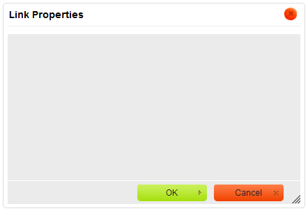
The result of this change can be seen immediately. Click the Insert a Link toolbar button in order to open the newly created (and so far empty) Link Properties dialog window.
Dialog Window Tab Elements
User interface elements that can be added to a dialog window tab are defined in the elements parameter, which is an array of CKEDITOR.dialog.uiElementDefinition objects.
Since we want to try a number of different types of dialog window UI elements, in this case the dialog window tab will consist of a larger textarea, smaller text field, a selection field (drop-down list), and a checkbox. We will also use HTML to create the tab description.
Each UI element is added inside the elements array, with the definition placed inside the curly braces ({}), separated from one another with a comma. The type parameter is a required one and defines the type of the element.
UI Elements: HTML
The first UI element we are going to use is the HTML type. The html type allows you to define the contents of a dialog window page by using pure HTML code. The HTML code to be placed inside the page is entered in the html parameter.
elements :
[
	{
		type : 'html',
		html : 'This dialog window lets you create simple links for your website.'
	}
]
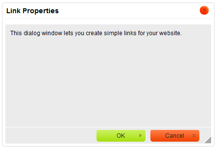
After adding the above code to the plugin source, the Link Properties dialog window looks like this.
UI Elements: Textarea
The element to be placed underneath the description is the textarea element that will be obligatory to fill in. We will use it to add the text that is displayed in the document and points to the inserted link.
In order to create a textarea we will use the textarea UI element type and assign it an id. The textarea will also need a label that will describe its purpose and can be added using the label parameter.
Since filling in the contents of the textarea will be obligatory, we will set the required parameter to true and inside the validate parameter add some simple validation that checks whether the field is empty. If it is, the validator will return an error message.
{
	type : 'textarea',
	id : 'contents',
	label : 'Displayed Text',
	validate : CKEDITOR.dialog.validate.notEmpty( 'The Displayed Text field cannot be empty.' ),
	required : true
}
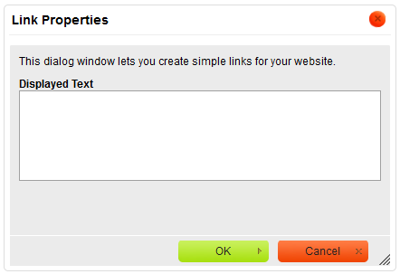
This is the appearance of the Link Properties dialog window after we apply the changes.
The size of the textarea can obviously be customized. If you want to change the element's dimensions, use the cols amd rows parameters as defined in the textarea constructor.
UI Elements: Text Field
Another UI element that we are going to use in the plugin is the text field (text input) element. We will use it to enter the Internet address of the linked page.
A text field lets you enter text into a single-line field and is meant for shorter entries. Its definition is very similar to the textarea — the main difference lies in the type parameter that is set to text.
The id and label parameters will be defined as done above. In our case this field is obligatory, so we will set its required parameter to true. The validation code inside the validate parameter will also be used to check whether the field was filled in. If it is empty, the validator will return an error message.
{
	type : 'text',
	id : 'url',
	label : 'URL',
	validate : CKEDITOR.dialog.validate.notEmpty( 'The link must have a URL.' ),
	required : true
}
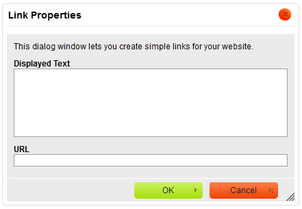
With the latest addition of the text field the Link Properties dialog window will look like this.
UI Elements: Selection Field
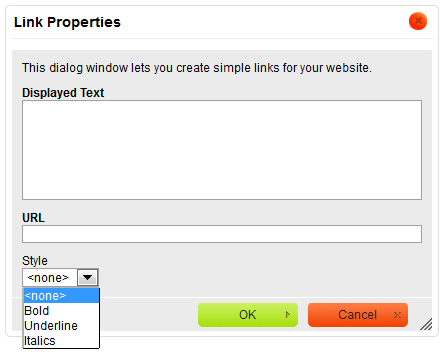
Another type of UI elements that we are going to try out is the selection field (drop-down list). In this case we will use it to allow the user to choose one of the pre-defined styles for the link text.
To create a selection field we need to set the type parameter of the element to select. As before, we will add the id and label parameters appropriate for this field. The items to be chosen from the selection list are defined inside the obligatory items array that contains the values along with their displayed text. The first item defined in the list will be used by default; you can also use the default parameter to change this setting.
{
	type : 'select',
	id : 'style',
	label : 'Style',
	items :
	[
		[ '<none>', '' ],
		[ 'Bold', 'b' ],
		[ 'Underline', 'u' ],
		[ 'Italics', 'i' ]
	]
}
After the selection field is added to the plugin dialog window and is expanded by the user, the style that was selected by default (the first one, if not defined otherwise) is highlighted.
UI Elements: Checkbox
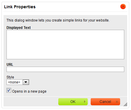
The final UI element to be added to the plugin dialog window is the checkbox. In this case the user will be able to select it if the link is to be opened in a new window.
In order to create a checkbox we need to set the type parameter of the element to checkbox. As before, the field will also get a standard id and label. Since we want opening in a new page to be a default behavior, we will set the default parameter to true in order to have the checkbox selected when the plugin dialog window is opened.
Please note that the default parameter needs to be placed in single quotes since it is a reserved JavaScript word.
{
	type : 'checkbox',
	id : 'newPage',
	label : 'Opens in a new page',
	'default' : true
}
The figure below shows the Link Properties dialog window complete with all the UI elements added above.
Plugin Behavior
The plugin now looks good — the toolbar button is in place and the dialog window is complete with a couple of sample UI elements. There is, however, one problem: it does not really do anything.
We will start with creating the onOk method that is invoked once the user accepts the changes introduced in the dialog window by clicking the OK button or pressing the Enter key on the keyboard. The method will be defined inside the CKEDITOR.dialog.add function, below the definition of dialog window contents.
onOk : function()
{
	// The code that will be executed when the user accepts the changes.
}
We shall start the onOk function from creating a link element and a data object that will store the data entered in the dialog window fields. The link will be based on a standard HTML <a> element and as a new DOM element it will be created by using the createElement function.
var dialog = this,
	data = {},
	link = editor.document.createElement( 'a' );
In order to populate the data object with the contents of the dialog window fields we will use the commitContent function.
this.commitContent( data );
To make the commitContent function work we will however first need to define the commit functions themselves. In order to do that, we will have to revise the code of the dialog window UI elements again.
The commit functions will have to be added to all user input elements of the plugin dialog window — the textarea, the text field, the selection field, and the checkbox. In each case the functions need to get the value entered by the user by using the getValue function and assign it to an appropriate attribute of the data object.
elements :
[
	{
		type : 'html',
		html : 'This dialog window lets you create simple links for your website.'
	},
	{
		type : 'textarea',
		id : 'contents',
		label : 'Displayed Text',
		validate : CKEDITOR.dialog.validate.notEmpty( 'The Displayed Text field cannot be empty.' ),
		required : true,
		commit : function( data )
		{
			data.contents = this.getValue();
		}
	},
	{
		type : 'text',
		id : 'url',
		label : 'URL',
		validate : CKEDITOR.dialog.validate.notEmpty( 'The link must have a URL.' ),
		required : true,
		commit : function( data )
		{
			data.url = this.getValue();
		}
	},
	{
		type : 'select',
		id : 'style',
		label : 'Style',
		items :
		[
			[ '<none>', '' ],
			[ 'Bold', 'b' ],
			[ 'Underline', 'u' ],
			[ 'Italics', 'i' ]
		],
		commit : function( data )
		{
			data.style = this.getValue();
		}
	},
	{
		type : 'checkbox',
		id : 'newPage',
		label : 'Opens in a new page',
		'default' : true,
		commit : function( data )
		{
			data.newPage = this.getValue();
		}
	}
]
We now have the values entered in the plugin dialog window in the data object. It is time to return to the onOk function and start building the contents of the link variable that contains the <a> element.
The URL of the linked page will be added to the <a> element by using the setAttribute function to update the href attribute of the link object with the contents of the url attribute of the data object.
link.setAttribute( 'href', data.url );
If the checkbox setting the link to open in a new page (newPage) was selected, we also need to set the target attribute of the link to _blank by using the setAttribute function again.
if ( data.newPage )
	link.setAttribute( 'target', '_blank' );
If the user decided to apply one of the styles from the drop-down list to the link, we have to add this setting to the link element. We will use a JavaScript switch statement to define the style setting based on the user's choice and use the setStyle function to add an appropriate CSS stylesheet rule to the inline style attribute of the link element.
switch( data.style )
{
	case 'b' :
		link.setStyle( 'font-weight', 'bold' );
	break;
	case 'u' :
		link.setStyle( 'text-decoration', 'underline' );
	break;
	case 'i' :
		link.setStyle( 'font-style', 'italic' );
	break;
}
We now need to insert the Displayed Text data (contents) into the link, in between the <a> and </a> tags. In order to achieve this we will use the setHtml function.
link.setHtml( data.contents );
Finally, the link object has to be inserted into the document, at the position of the cursor. We will use the insertElement function for that.
editor.insertElement( link );
Full Source Code
To see the full contents of the plugin.js file, .
You can also download the whole plugin folder inluding the icon and the fully commented source code.
CKEDITOR.plugins.add( 'simpleLink',
{
	init: function( editor )
	{
		editor.addCommand( 'simpleLinkDialog', new CKEDITOR.dialogCommand( 'simpleLinkDialog' ) );

		editor.ui.addButton( 'SimpleLink',
		{
			label: 'Insert a Link',
			command: 'simpleLinkDialog',
			icon: this.path + 'images/icon.png'
		} );

		CKEDITOR.dialog.add( 'simpleLinkDialog', function( editor )
		{
			return {
				title : 'Link Properties',
				minWidth : 400,
				minHeight : 200,
				contents :
				[
					{
						id : 'general',
						label : 'Settings',
						elements :
						[
							{
								type : 'html',
								html : 'This dialog window lets you create simple links for your website.'
							},
							{
								type : 'textarea',
								id : 'contents',
								label : 'Displayed Text',
								validate : CKEDITOR.dialog.validate.notEmpty( 'The Displayed Text field cannot be empty.' ),
								required : true,
								commit : function( data )
								{
									data.contents = this.getValue();
								}
							},
							{
								type : 'text',
								id : 'url',
								label : 'URL',
								validate : CKEDITOR.dialog.validate.notEmpty( 'The link must have a URL.' ),
								required : true,
								commit : function( data )
								{
									data.url = this.getValue();
								}
							},
							{
								type : 'select',
								id : 'style',
								label : 'Style',
								items :
								[
									[ '<none>', '' ],
									[ 'Bold', 'b' ],
									[ 'Underline', 'u' ],
									[ 'Italics', 'i' ]
								],
								commit : function( data )
								{
									data.style = this.getValue();
								}
							},
							{
								type : 'checkbox',
								id : 'newPage',
								label : 'Opens in a new page',
								'default' : true,
								commit : function( data )
								{
									data.newPage = this.getValue();
								}
							}
						]
					}
				],
				onOk : function()
				{
					var dialog = this,
						data = {},
						link = editor.document.createElement( 'a' );
					this.commitContent( data );

					link.setAttribute( 'href', data.url );

					if ( data.newPage )
						link.setAttribute( 'target', '_blank' );

					switch( data.style )
					{
						case 'b' :
							link.setStyle( 'font-weight', 'bold' );
						break;
						case 'u' :
							link.setStyle( 'text-decoration', 'underline' );
						break;
						case 'i' :
							link.setStyle( 'font-style', 'italic' );
						break;
					}

					link.setHtml( data.contents );

					editor.insertElement( link );
				}
			};
		});
	}
});
Working Example
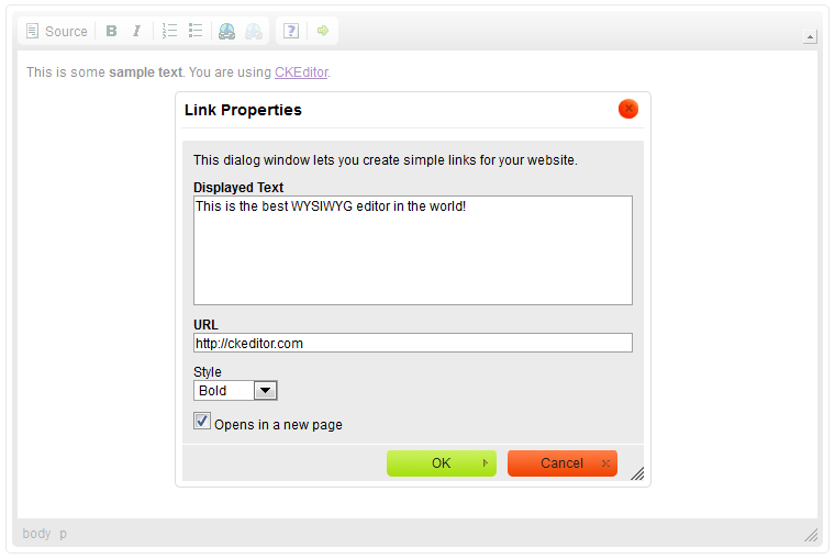
The plugin code is now ready. When you click the Insert Link toolbar button, the custom Link Properties dialog window will open. Fill in the obligatory Displayed Text and URL fields, and click the OK button. The checkbox configuring the link to open in a new window is checked by default, but you can uncheck it. You can also change the link style by choosing one of the options from the drop-down list.
The newly added link will be inserted into the document and displayed with a style selected in the dialog window.
If you switched to Source view, you could see all the information from the plugin dialog window added as link contents and attributes.
Further Enhancements
The SimpleLink plugin is now able to add a new link element to the document by using a custom and simplified dialog window, but does not make it possible to edit an already existing element by using the plugin dialog window. For tips on how to implement this feature along with the context menu support check the Creating a Simple CKEditor Plugin, Part 2 tutorial.

